In Excel of course 😉
📘 Data Visualization
I just finished an amazing book that talks about the importance of improving your storytelling when it comes to presenting data - something all data scientists should learn more about!
🔗 Amazon Book Link: https://t.co/jeOP6W3sqt


📘 Book Summary
- Understand the context
- Choose an appropriate visual display
- Eliminate clutter
- Focus attention where you want it
- Think like a designer
- Tell a story
💼 Case Study
Let's look at an example because I find it the best way to learn. She had multiple case studies in her book but we will focus only one.
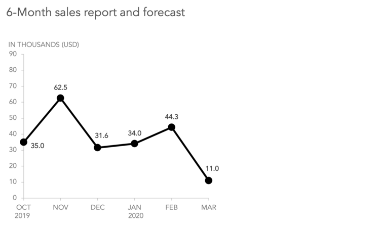
Before
Notice how she already has improved this graph by getting rid of clutter (gridlines, 3 letter months) and focusing our attention (light grey axis, dark black line).
But, this does not tell a story.
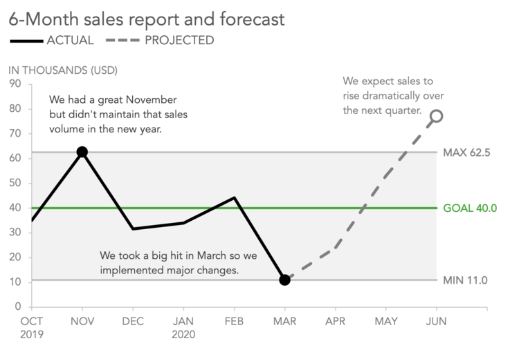
After
By adding a few words to describe why the data changes, removing unnecessary data on the line itself, and adding a pop of color you really can see a story start to emerge.
Notice the use of a dashed line to show you that data is projected data, and is also grey - not black - so it's not drawing your eyes immediately. The green pops - and that is what grabs attention along with the dark black line.
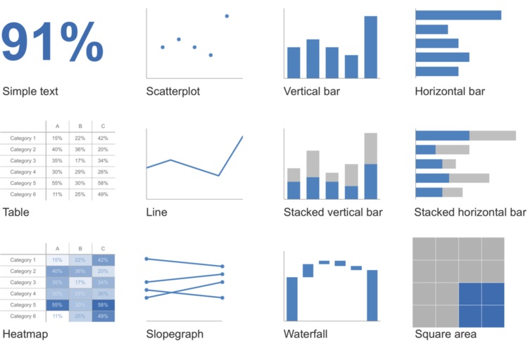
📊 Types of Graphs
She also talks in depth about which graphs tend to work well with what types of data. She also HATES pie charts.. which I agree - she even called them evil in her book! 😈
🎬 Behind the Scenes
I am not working on anymore YouTube videos for a few weeks because I am in the process of filming my Excel for Estimators course which has been on my list for SO long.
I started filming this weekend on my day off - no rest for the wicked!
